EBISUYA JAPANESE MARKET REDESIGN
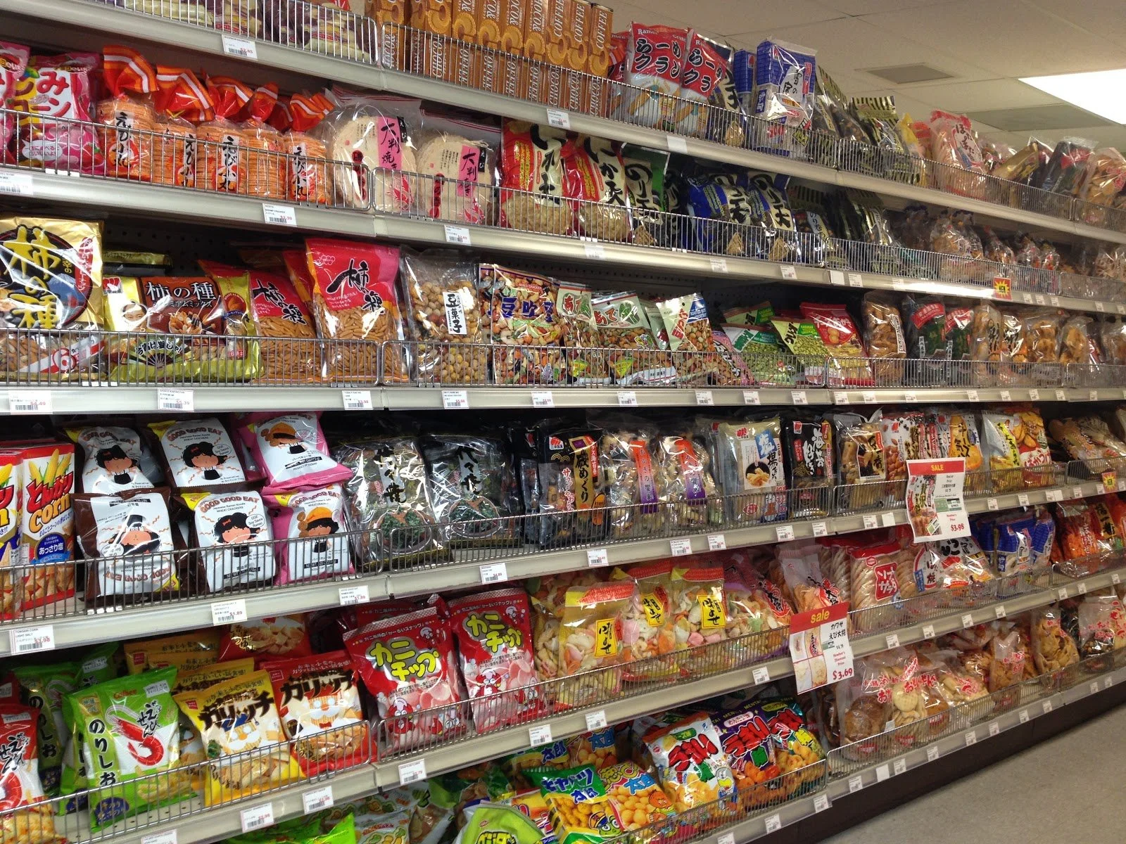
Ebisuya is a family-owned market offering a delightful mix of Japanese products, fresh grab-and-go food, household items, clothing, and educational supplies for children. Our project aims to analyze the layout's impact on the consumer's shopping experience through observations and interviews. With this, we'll provide valuable suggestions for an even better shopping journey at Ebisuya.
DELIVERABLE
Layout redesign suggestions
SETTING
Group project with Niki Alden and May Lam
TIMELINE
8 weeks
Brand
Ebisuya prides itself on upholding Japanese traditions, fostering a strong sense of community, and promoting a deep cultural connection to its roots. The brand emphasizes a joyful shopping experience, offering light, comfortable, and stress-free surroundings that reflect the essence of Japan's heritage and hospitality.
Style Choices
Carts
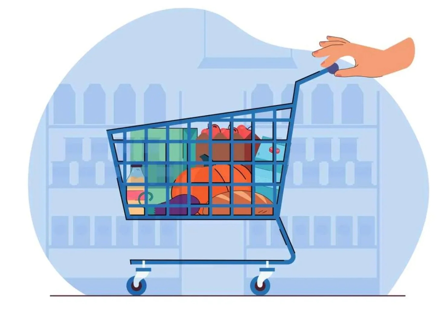
Smaller carts = For purchase of single-use items, children friendly
Lights
Dimmer at outskirts, more direct on special items and areas, natural for leisure eating
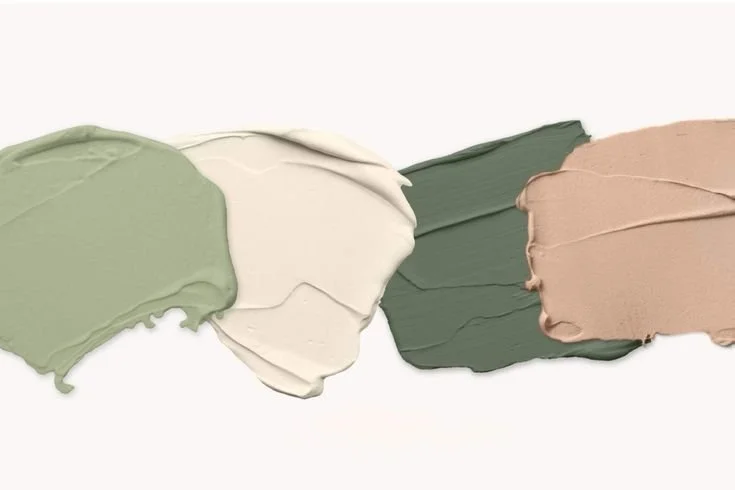
Colors
Green = Airy, simple, light, naturistic
Beige tones = Casual, stress-free
Family Based Groups - Community Bonding - Middle Age Parents
Drive vans to hold lots of relatives
Work 9-5 stable jobs, medium income of 60k
Cook often
Peer Friend Groups - Shared Learning Experience - College Students
Take public transportation or walk, nearby, and don’t drive
Need food and buy a few items, from studying and loans
Single - Running Errand - Working Adult
Rush on time, work nearby, pick up lunch
New worker, low salary of 30k, have loans
Audience Demographic
Audience Psychographic
Long-term: Traditional, Stable, Family-Oriented
Loyal to particular items to make traditional dishes, reminisce memories of food connected to culture
Short-term: Explorative, Adventurous, Fun
Sporadically buys products for the experience, treats grocery shopping as an adventure
Navigation and Information
Systems within the store encourage consumers to shift from one area to another during their visit.
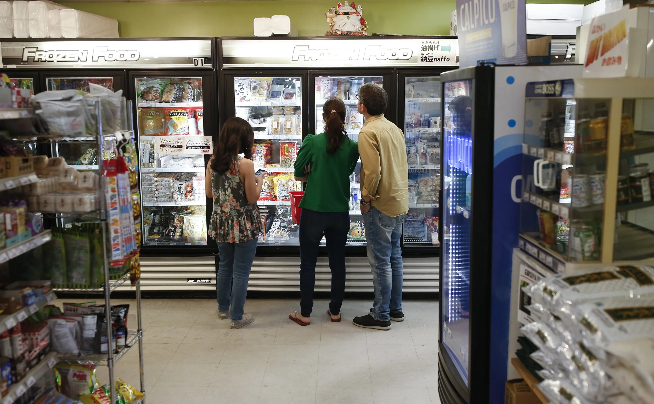
Food court area with two counters: one for sushi (order-pay at side register) and one for noodles/bento (order-pay before pickup or staff delivery).
Food orders placed using checkbox menus and supported by posters showcasing dish images and appealing colors.
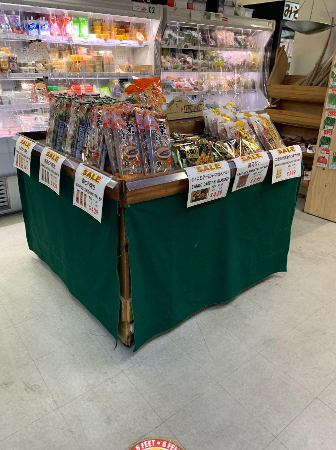
Eye-catching colors and phrases like "discount" or "sale" draw attention.
Hanging signs indicate open/closed status and hours of food counters.
Pre-packaged food shelves offer grab-and-go convenience with detailed signs, instructions, and no need for weighing/pricing.
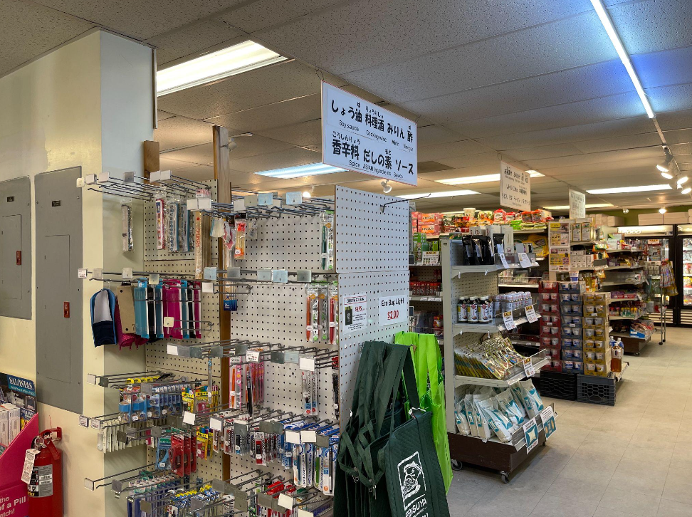
Language options and picture instructions cater to a diverse consumer base.
Fresh food counter wait times lead customers to the grocery section.
Store layout includes confusing placement of products in different areas.
Aisle signs are too high and lack attention-grabbing colors, making navigation challenging.
Prices are displayed with small black text tags, and lack of barcode scanners.
Density of people shifts from food areas during meal times to grocery shopping areas during wait times.
Interviews reveal typical shopping durations of half-hour to one hour.
Long-term users find products easily due to familiarity.
Limited staff presence due to their section-specific responsibilities.
Interior Design
Food court (Open kitchen & Sitting area)
A place to rest in the middle of the shopping
Booths (Promotions & Sales)
Use booths for the sale items instead of end caps
Phonic wall (Vibrant illustrations)
Unique wall printed with Japanese phonics
Checkout area (Far from the Entrance)
Columns cover up sections of food
Meat & Diary (Near the front end)
Need to relocate as far as possible from the entrance
Aisle area (Necessity order)
Odd combination of seaweed with chocolate
Research Method
Personal Testing
Make layout after walking through
Compare to actual layout
Note differences
Research layout information to base question to base questions off of
Interview Questions
Demographic information
Frequency/ length of patronage
Traditional store or specialty store
Time spent in the store
Navigation ease
Impulse purchase
Results & Takeaways
Personal Testing Results
Navigation is more complicated
Different use case
Need to preserve cultural aspects of the store
Need to adopt a plan
Interview Results
Spend $50-$100 per trip
Mostly come with the intent of impulse purchase
Mostly buy specialties
Social shopping
Little to no issue navigating
Top 10 Findings
Strengths
Food courter
Unique food selection
Authenticity
Location of Rice
Front Store sales
Shortcomings
Shopping carts
Signage
Lack of Signature
Organization
Physical Space
Five Improvements/ Suggestions
Cart Use
Encourage cart use by changing the placement of carts. Eventually, increase cart size.
Existing Signage
Make sure all signs are in both Japanese and English. Also, improve the readability of signs
New Signage
Try adding signs like:
If you like ___ you should try ___
___ is great in ___
Try pairing ___ with ___
Rearrange
Flip drinks with meat. Pair similar categories together consistently and complements nearby
Store Interior
Open up the store interior by removing some pillars to create a more open and welcoming feeling
