Heiroom:
Memory Recording Platform
Heiroom is a digital platform dedicated to fostering family connections through both its desktop app and website. Our collaborative efforts revolved around crafting an interface for the Heiroom platform, one that resonates with the elderly and provides an engaging avenue to share profound life experiences with their family.
DELIVERABLE
Tablet Interface Design for Heiroom
SETTING
Group project with Nina Houston, Stephanie Wang, Santiago Martinez-Moure, Afroditi Georgiadi, and Evan Zlotnick
TIMELINE
12 weeks
ROLE
Researcher & UX/UI Designer
Problem
Heiroom aims to create a memory recording service for retirement home residents. This solution should empower them to use it independently during their leisure time, without external help. However, they currently lack a tangible recording product with an engaging question set of prompts tailored to the elderly audience.
Solution
In three months, we successfully delivered an intuitive interface, an effective recording process, and relatable prompts. Our collaboration extended to working alongside Chris Budnik, the company's founder, and Ashley Hutchison, the director of technology, in bringing to fruition the foundational design of Heiroom's memory recording service.
Process
We followed a lean UX design thinking process to ensure that my decisions were supported through user research and feedback.
Persona
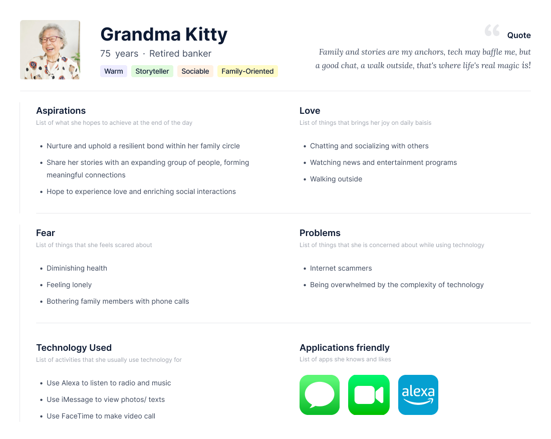
To better understand our users, we developed a persona named Grandma Kitty. Kitty is a 75 year old woman living in a retirement home in Chelmsford, MA. She has two daughters and four grandchildren who live in Boston and come to visit her once a month.
Competitor Analysis
We identified five competitors in the industry and analyzed their products. They all target senior users, aiming to help seniors connect better with family and friends.
Secondary Research
What Aspects of Interfaces Work Best for Elderly People?
Basic touchscreen tasks are easy for the elderly, except for tapping small targets.
Repetitive overshooting due to slow motion or over-pressure gestures.
Avoid multiple mode displays, use clear indicators for mode changes.
All features with clear labels/instructions to avoid confusion.
Good-sized buttons, proper spacing, larger text font, labeled icons, and labeled buttons for important features.
The elderly prefer tapping over dragging and enjoy slow-motion interface, and audio confirmation while tapping (especially for visual impairments).
Consistent main navigation placement, and important functions at the top to prevent accidental touching.
Additional Elderly Loneliness Research - A Need for Platforms like Heiroom
Lonely older adults are more likely to suffer pain, breathing issues, fatigue, and confusion.
High loneliness linked to increased nursing home deaths, and life support use.
Clinicians emphasize end-of-life vulnerability for lonely individuals and suggest interventions.
Living alone relates to reduced social support and increased loneliness.
Managing retired life is crucial, lack of support is common among the elderly living alone.
Seniors value connectedness, technology essential for staying connected.
More than half of seniors prioritize being close to friends and family.
84 percent of seniors nationally consider technology vital for connecting with the world.
User Survey
To gather the information that guided our design process, we found it valuable to directly question our primary user base: elderly individuals. Most survey respondents indicated that they particularly enjoy sharing stories about their family’s history. In identifying these topics of interest, we refined our prompts to be the following:
Where did you meet your spouse, and how did you/they ask them/you on your first date together?
Share a time when you were especially proud of one or all of your children.
What is one thing you most admire(d) about your parents?
Share a funny story of your grandchildren as toddlers!
In addition to family history, respondents stated that they enjoyed sharing stories about significant life events. The prompts relevant to this topic are:
What was your first car, and share a memorable experience you had with it!
Where did you work for your first job? What aspects of it were enjoyable and which aspects could have been better?
What was your wedding like? How did your spouse look, who was in attendance, and/or what song did you have your first dance to?
When did you or your parents first come to the United States?
What was the best vacation you have taken?
Finally, respondents demonstrated interest in sharing life lessons with younger generations. The questions we curated to elicit stories of life lessons are:
What in life is most important to you, and why is it so significant?
Share a moment when you were especially proud to be you.
If you could give one piece of advice to your grandchildren, what would it be and why?
Have you ever not succeeded at something? What did you learn from that experience to help you succeed after the fact?
User Interview
Not only did we create a survey, but we also conducted an interview with a member of our user group. From this interview, we learned many things about how the user communicates with her family and the stories she likes to tell. These were our findings:
She is becoming comfortable with texting but generally likes phone calls better. She feels that anything that happens on a daily basis she wants to tell her family she could (so no daily stories she couldn’t just text to her family).
She feels comfortable bridging up conversation topics with her family while with them if she thinks of a story she wants to tell.
She was interested in the idea of narrating a story based on a picture.
She mentioned that she would be interested in talking about photos of:
Family weddings: her own, her children’s, etc.
Pictures of her grandparents.
Pictures of her parents.
Mentioned prompts/subjects she would want to talk about:
Childhood memories with her brother.
Hobbies such as quilting.
Trips with family.
Weddings.
Living in a retirement community during COVID and how much better her
quality of life was there versus if she had been home alone.
Future plans and projects.
She mentioned that some of her friends have difficulty using phones but they would have an easier time recording stories on a computer.
She was initially more interested in using the interface on a computer screen rather than a physical booth.
Expert Interview
Holding an expert interview with the Nursing home Administrator helped us better understand the elderly’s time in nursing homes, the interactions and communications with their families, and their use of technology as well as their response and attitude towards it. The main themes we learned are:
Personal life in nursing homes:
Similar problems to college students in dorms
Family visits: bring food, discuss outside life
Communication with families:
40% of elders own cell phones for texting/calling
Facility phones available if no personal cellphone
Phone calls are more common than texting
Technology use:
Smart technology (AI, Alexas, smart TVs) appreciated
Alexa and voice commands are common for easy use
Positive attitude towards technology
Willing to learn and improve tech skills with guidance
Prototype Version 1.5 (after user interview)
Following our primary and secondary research results, we developed the initial prototype (V1) and proceeded with usability testing and user interviews. Incorporating the feedback obtained, we refined the prototype to version 1.5.
Prototype Version 1.5 (after user interview)


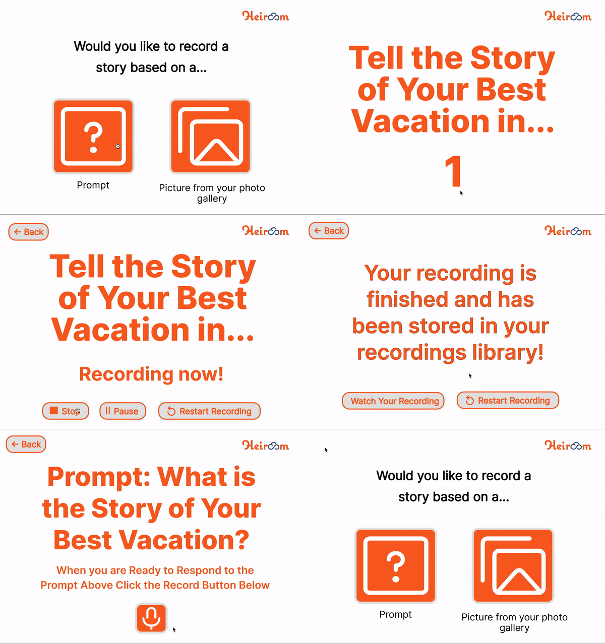
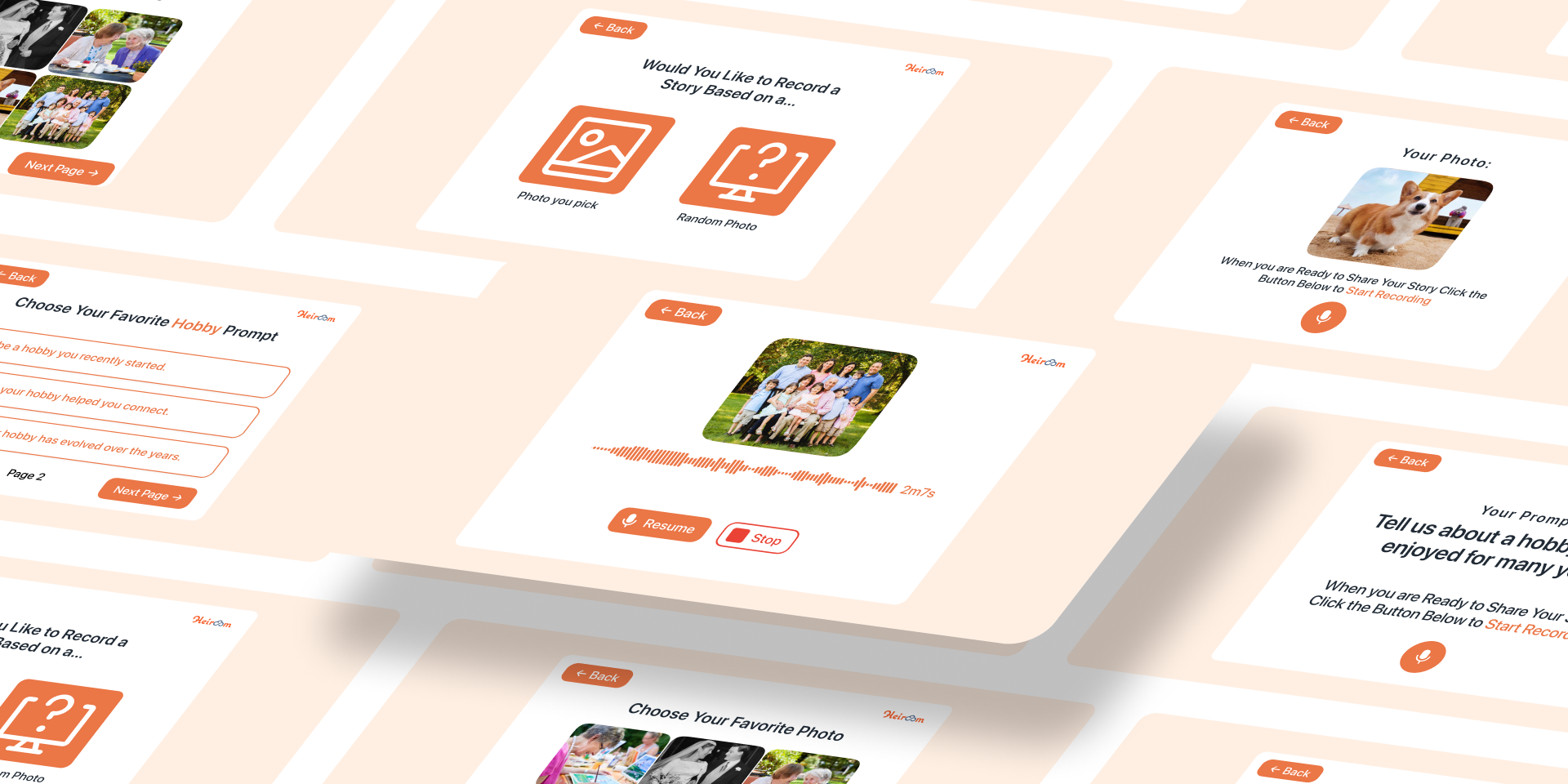
Option to record a story based on Prompt



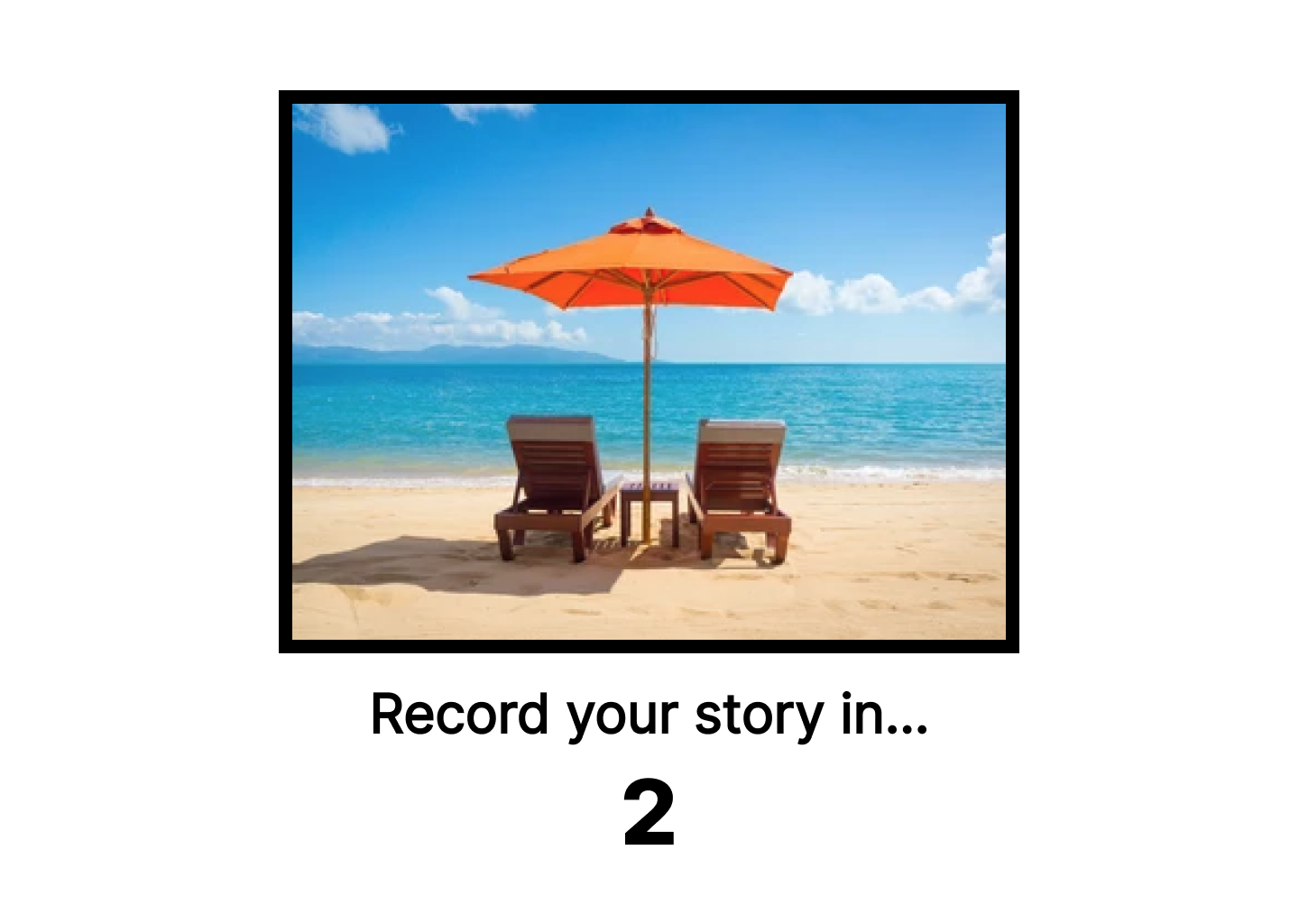


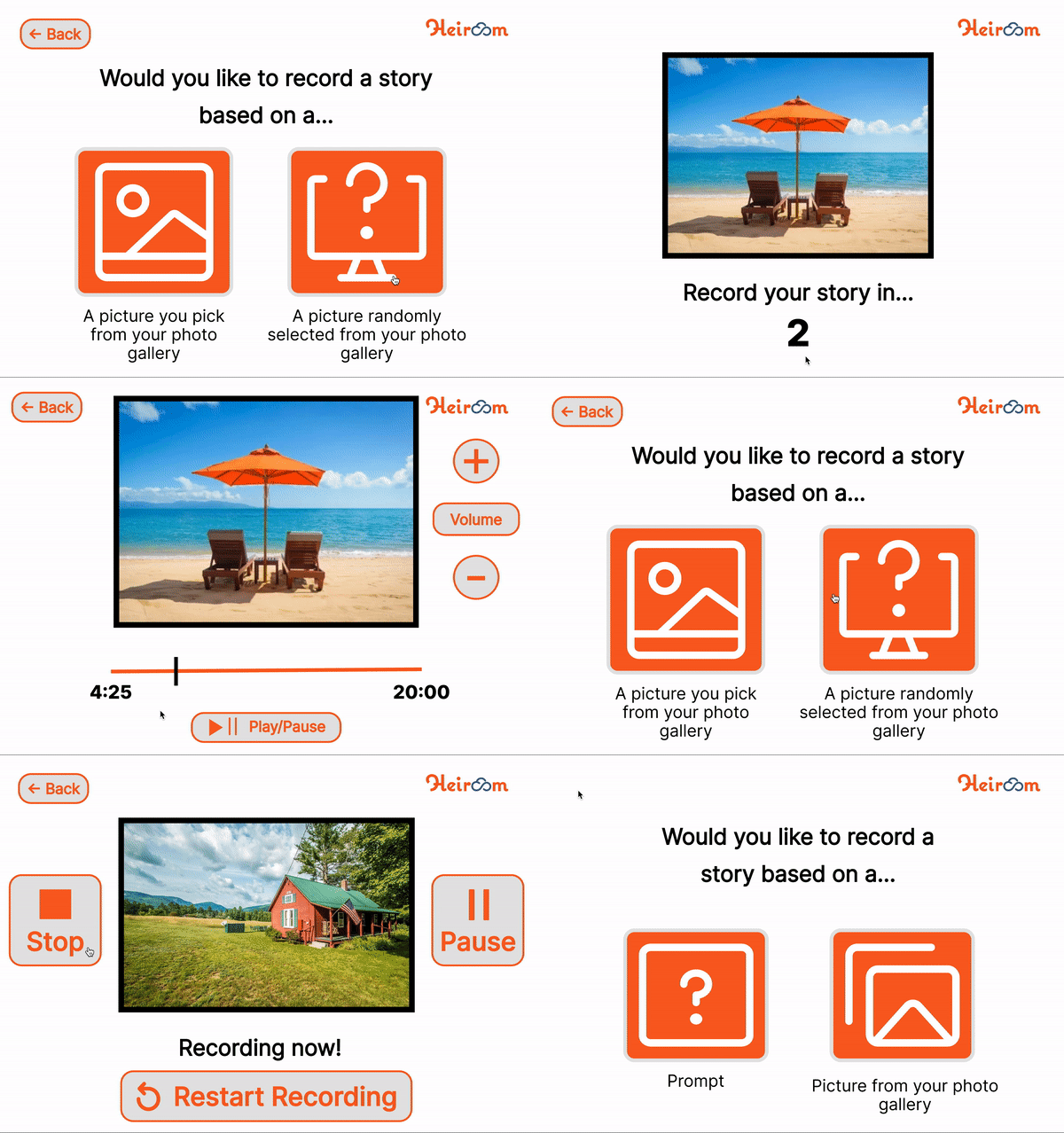
Option to record a story based on Picture from photo gallery
Design Changes
Through the user interview and advice from Chris and Ashley, the prototype gradually evolved from the base product (V1 and V1.5) to the prototype Version 2 with more alteration (V2). In this section of the report, we will give an explanation of the changes made and why.
Background color
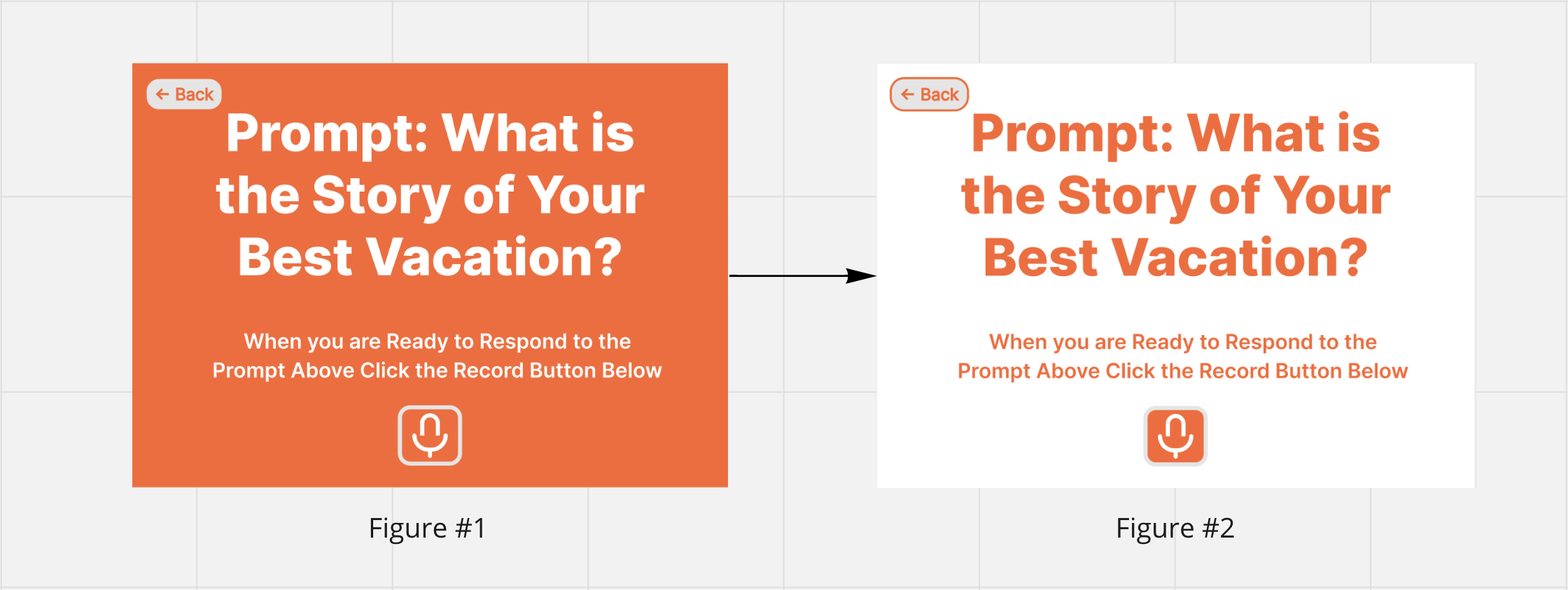
The user's initial suggestion was to replace the orange background of the prompt desktops with white. This change was motivated by the orange background being uncomfortable on the eyes and affecting readability.
2. Stop, pause, play, and restart buttons
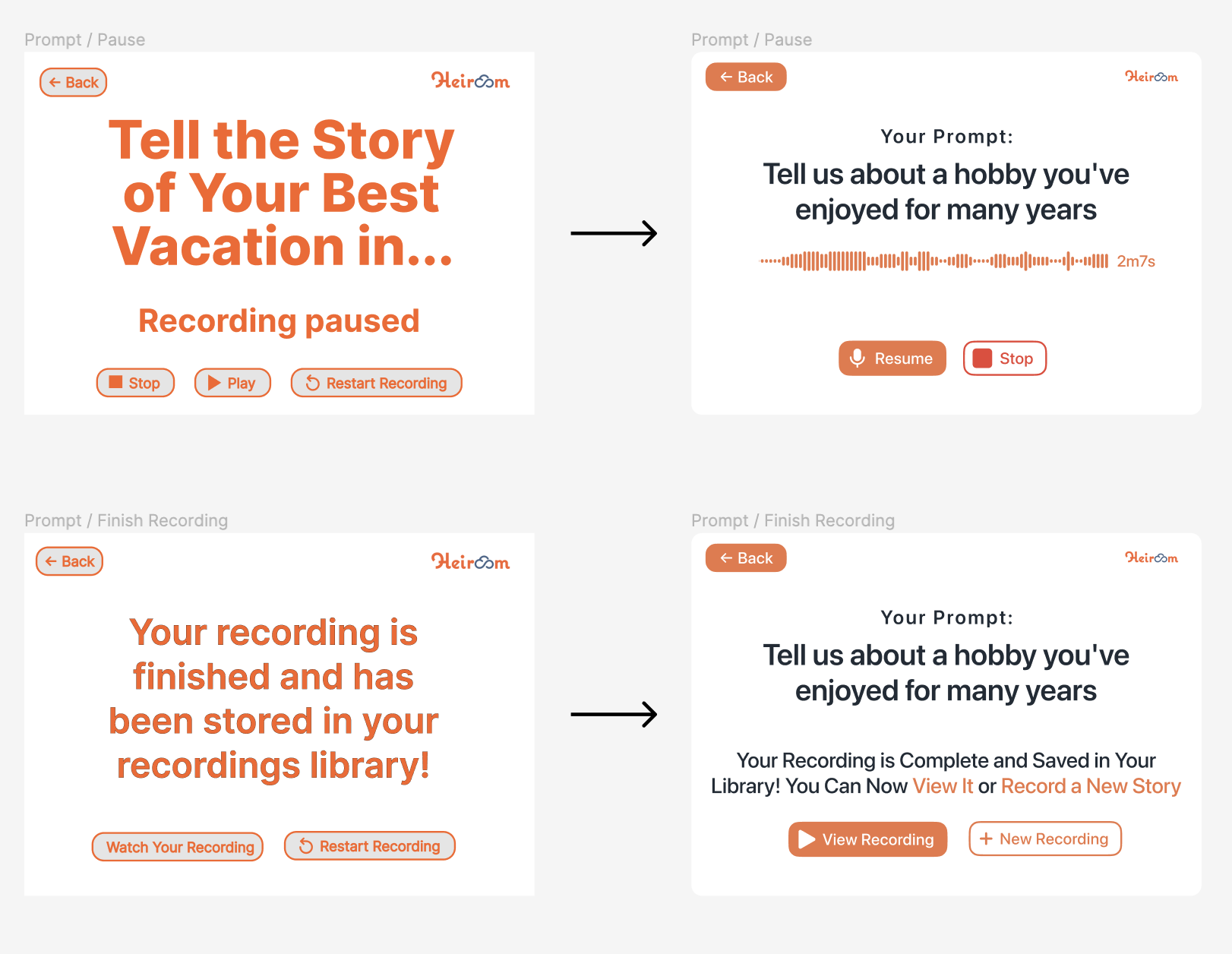
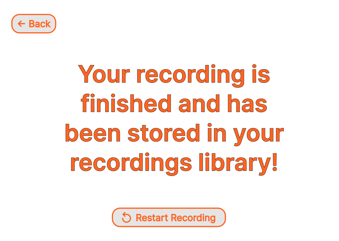
Another change was adding stop, pause, play, and restart buttons and subsequent pages for those buttons. Initially, we had not taken into consideration that the user may need to pause their recording to get a drink of water or might want to start the recording or restart the recording. In the beginning, our designer model stopped after the recording began.


3. Brand representation & “Watch recording” screen
We made two changes throughout the entire Figma and those were adding the Heiroom logo and changing the orange to the exact hex color code that Heiroom uses.
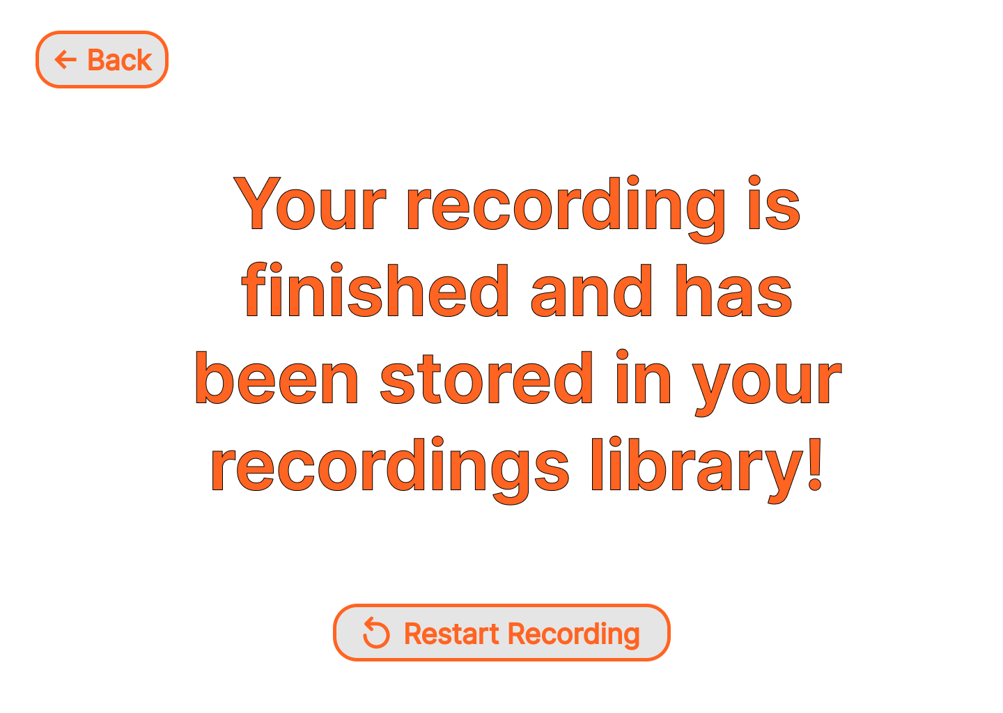
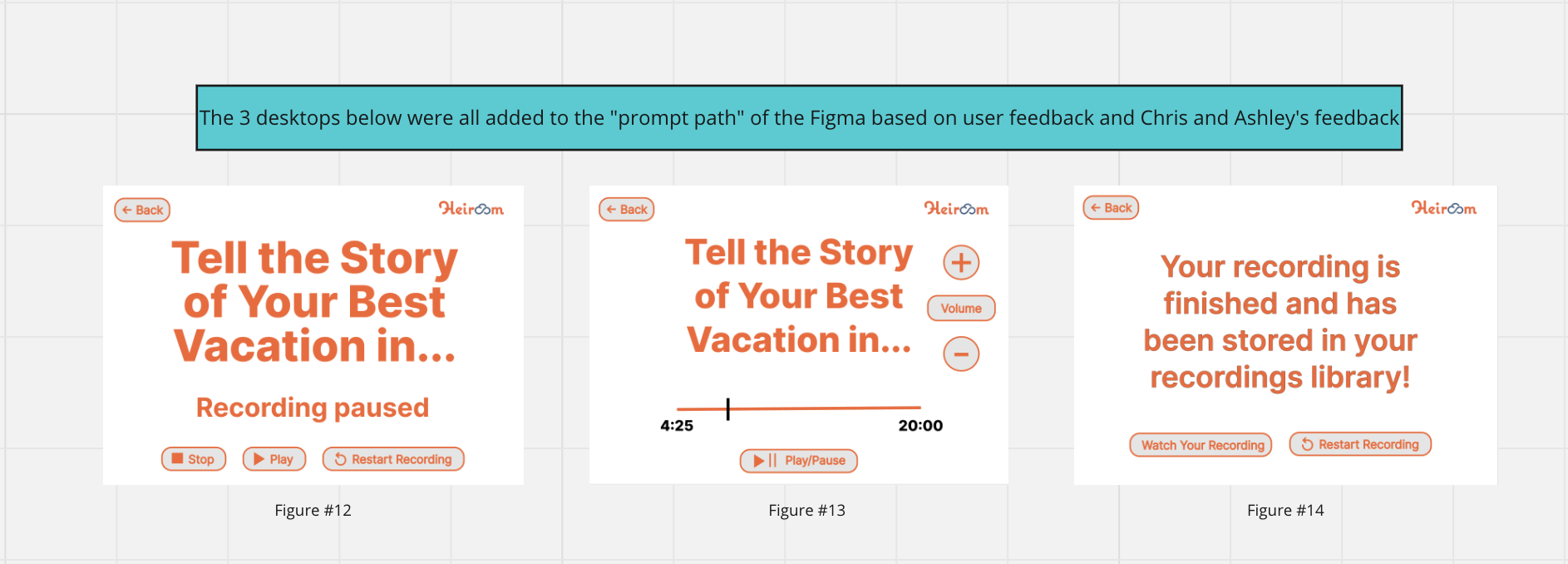
We continued to add the pause, stop and restart recording buttons, this time adding them to the prompt section. We also added the paused, finished recording, and watch recording desktops to the prompt pathway.

4. Page numbering
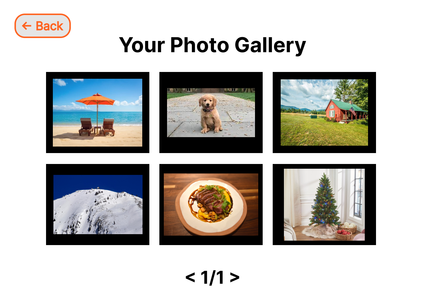
We changed the way the page numbers were shown at the bottom of the user’s photo gallery page. The user who tested the Figma said that the mental model we had initially would not make sense to older users. We also added a section page of the photo gallery to show what the previous page button would look like and how a user could go from page to page.

5. Button size
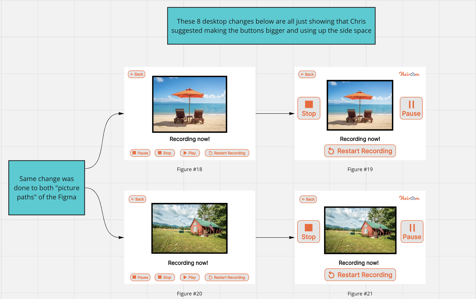
When discussing the prototype, Chris’ main feedback regarded the size of the pause and play buttons, so he suggested that we use the space on the side of each of the pictures. The change to enlarged buttons is to make sure that an elderly user can easily see and tap the buttons if necessary.

6. Volume bars
The final significant change was adding volume bars to the “watch your recording” desktops, so that if users had difficulty hearing they could raise the volume on the recording as high as they wanted.

Task Analysis
After understanding the research results, learning how senior users feel about the concept of story-sharing, and watching them interact with the prototype, we created the following flowchart that covers the behavioral, cognitive, and emotional steps seniors take while interacting with the platform.
Design Prototype V2
Incorporating design changes derived from user and stakeholder testing on prototypes V1 and V1.5, we have developed the design for the prototype V2. This version represents a synthesis of user preferences and stakeholder feedback, resulting in a more polished and effective design solution.
Option to record a story based on Prompt (Design Prototype V2)
Option to record a story based on Picture from photo gallery (Design Prototype V2)
Usability Testing & Final Design Changes
After we have our prototype version V2, we comeback to our users to collect their feedback to design our final product. In this section of the report, we will give an explanation of the changes made and why.
1.Heiroom Color Update
After consulting with our stakeholders, we made a decision to modify Heiroom's color scheme. Initially, we shifted the background color from Heiroom's signature orange to white, retaining the orange only for the text. However, feedback from users indicated that the orange text was still too bright, causing discomfort to their eyes. In response to this, we have adjusted the shade of orange to one that offers better contrast against the white background and is less straining on the eyes. While this new shade differs slightly from Heiroom's traditional color, it maintains the brand's identity and improves readability for users.
2. Recording Process Clarity
During our usability testing, we discovered that users were unclear about the recording process, specifically regarding the pause, play, and restart recording buttons. The confusion arose because users mistook the play button, which is meant to resume recording after a pause, as a button to playback what they had just recorded. This misunderstanding was compounded by the presence of a "watch your recording" button on the following screen, leading users to believe both buttons had the same function. Additionally, the label "Restart the recording" was misleading; users thought it would delete their current recording, rather than indicating their recording was saved and they could start a new one. To address these issues and enhance user understanding, we have decided to rename the play button to "resume" and change "restart" to "new recording." This should clarify the recording process for users.
3. Button Display
Users appreciated the V2 version for its clear explanations accompanying each button, like instructions to click the 'record' button to start recording. They favored the combination of both icons and full button names, enhancing usability. Additionally, the back button functioned as expected, guiding them to their anticipated destination.
4. Size & Consistency
Users questioned why the pause, stop, and restart recording buttons were larger and positioned on both sides of the screen for photo recording, as opposed to being at the bottom like in the prompt recording screen. They expressed a preference for smaller buttons, similar to those in earlier versions. Consequently, we aimed for consistency across both interfaces, choosing a button size that's slightly larger than the original but smaller than in V2. This decision initially contradicted stakeholders' preference for separate pause and play buttons on different sides of the screen. However, users favored having these controls together at the bottom. After presenting this user feedback to the stakeholders and finalizing the screen design, they agreed to relocate the buttons to the bottom of the screen.
5. Missing Screens
In our initial prototype testing, we informed users that they were interacting with an early version of the app, which did not include the full flow or all elements. We clarified this when users inquired about missing features, such as the prompt selection page or the recording bar. However, we realized the importance of these elements; users' questions indicated they expected these features to be present. Consequently, we have gathered their feedback and incorporated these crucial elements into the final prototype of the app, ensuring a more complete and user-friendly experience.
Final Design
Following user testing of the V2 prototype and gathering user feedback, we have completed the final design of the Heirrom recording platform. This version integrates changes suggested by both users and stakeholders, addressing the remaining issues identified in the previous three versions. The result is a comprehensive and user-friendly design that meets the needs and resolves the pain points experienced with earlier iterations.
What I learned
User and Stakeholder Testing
The user testing and discussions significantly impacted our prototype's development. Initially lacking key features for a seamless interface interaction, we only realized this during user testing, which revealed a more complex process than we initially considered. User testing not only provided new perspectives but also fresh eyes on the Figma prototype. Our semester-long project led to fixation on certain aspects, and user testing helped us refocus and see the big picture.
User Survey
Incorporating survey data, we developed 13 diverse story prompts that resonate with users. We intend to refine this set based on user engagement feedback, gauging the efficacy of different prompts. Additionally, our Figma prototype includes a random photo selection feature, fostering alternative story triggers. A potential future evolution involves linking recorded stories to Heiroom images, enriching family experiences.
Expert Interview
Even though we were not able to interview the geriatric expert, the interview with the Nursing Home Administrator significantly helped us in the design process of our product as we learned more extensive details about their life and experiences from an individual who observes them every day. Getting to know more about their interactions with their family throughout visits as well as their use of technology and their approach to it were all significant to our user interface, the prompts we added, and our overall product design.
Our Prototype
Tap the button below to explore and test our prototype.

